Typography Worksheet:
Write out the answers to these questions in complete
sentences.

Label and define all of the above numbers:
Ascender Line – Imaginary line that determines the height of
ascenders
2. Base Line – Imaginary line where all the characters rest
3. Ascender – The distance between the base line and the ascender line
4. Cap Height – Height of the capital letters
5. Descender – Stroke of a letter that dips below the base line
6. Ascender – Stroke of a letter that rises above the mean line
7. X-height – The distance between the flat top and bottom of a lower case letter that has no ascender or descender. The distance between the base line and the mean line
8. Cap Line – Imaginary line which determines the height of the capital letters
9. Mean Line – Imaginary line that determines the height of lower case letters
10. Descender Line – Imaginary line which defines the bottom reach of descenders
Define Serif: The hooks on letters that make them easier to
read
Define Sans-Serif: Without serif
When do you use Antique Fonts? For a nostalgic feel
At most how many words should be Decorative Fonts at a time? Three
What does a script font resemble? Handwriting
What element of design does script represent? (From elements lesson) Line
Why use Symbol Fonts? Embellishmenthttp://www.csse.monash.edu.au/~cema/courses/CSE5910/lectureFiles/images/lect5b/fontDecorativeBody.GIF
Define Typography: Art and technique of arranging type in
order to make type visible
Why do designers need a solid foundation in typography? Because everything you touch, see and create is impacted by the use of writing styles and techniques
Kerning: the space located between individual letters of a word
Leading: the space between the lines of text
Tracking: the creation of “rivers” of white space throughout the text body
When do you use the following?
Center Alignment: Headlines or titles
Right Alignment: more professional look, frequently used for business cards
Justified Alignment: news papers and text books, can cause tracking.
Center Alignment: Headlines or titles
Right Alignment: more professional look, frequently used for business cards
Justified Alignment: news papers and text books, can cause tracking.
What is remembered: good styling or bad styling? Bad styling
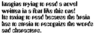
What is legibility? The ability to easily read something
Type size smaller than 7pt is: difficult to read
Type size smaller than 3pts is: utterly illegible
Type range for legible type is: 8 to 14 pt
What do you use for long passages? serif
What case do we use for Body? Upper and lower
What is measure? Width of the text column
What can you tell me about Ragged Edges? It’s the uneven side of a text column
What are some ways text can be used and what font types do
you use for each?
You can set text into regular shapes such as squares, triangles, diamonds, and circles, or format more irregular (organic) shapes. The text need not cover the entire surface, for words, or letters, or numbers can be used in a linear fashion - bending and curving to describe the contours of a particular form. You can use any font type, really. Legibility is not as big of a concern when creating images with text.
You can set text into regular shapes such as squares, triangles, diamonds, and circles, or format more irregular (organic) shapes. The text need not cover the entire surface, for words, or letters, or numbers can be used in a linear fashion - bending and curving to describe the contours of a particular form. You can use any font type, really. Legibility is not as big of a concern when creating images with text.
**Read ALL of it.
Answer the following:
Why is choosing and using the right font important? (Two
reasons) Because it sets the style and tone of a document and it is an
unconscious persuader.
What are the two most important things to remember? Type
should not overpower the text and there are no good and bad typefaces, just
appropriate and inappropriate
What is appropriate? What do you have to consider? Appropriate is a type face that suits what you’re trying to say. You should consider your reader and the feeling you’re trying to convey.
What is appropriate? What do you have to consider? Appropriate is a type face that suits what you’re trying to say. You should consider your reader and the feeling you’re trying to convey.
Tell me the rules: (there
are 10)
- Body text should be between 10 and 12 point, with 11
point best for printing to 300 dot-per-inch printers. Use the same
typeface, typesize, and leading for all your body copy.
- Use enough leading (or line-spacing). Always add at
least 1 or 2 points to the type size. Example: If you're using 10 point
type, use 12 point leading. Automatic line height will do this for
you--never use less than this or your text will be cramped and hard to
read.
- Don't make your lines too short or too long. Optimum
size: Over 30 characters and under 70 characters.
- Make paragraph beginnings clear. Use either an
indent or block style for paragraphs. Don't use both. Don't use neither,
either.
- Use only one space after a period, not two.
- Don't justify text unless you have to. If you justify
text you must use hyphenation.
- Don't underline anything, especially not headlines
or subheads since lines separate them from the text with which they
belong.
- Use italics instead of underlines.
- Don't set long blocks of text in italics, bold, or all
caps because they're harder to read.
- Leave more space above headlines and subheads than
below them, and avoid setting them in all caps. Use subheads liberally to
help readers find what they're looking for.
No comments:
Post a Comment